Design & Development
Week 11:
Asset Creation
Friday 13th - Sunday 15th May 2022
WEEK 11 -
TO DO: CREATE LOADING SCREEN
PURPOSE FOR ASSET CREATION
After a series of playtests and establishing ways to overcome the problems we've faced, we've concluded that it'll be best to create a 'loading screen' / introduction page that introduces players to the experience before they play. This will allow for the 'snowflakes' to fall and essentially, the entire server to load before they can begin. This prevents lagging and connection issues. In addition to this, we can kill two birds with one stone and on this page, include a brief outline of the experience to ensure players know what they are doing and how to do it. This is because we found there were a few issues with understanding how to play and how to interact physically.
WHAT WILL I BE DOING?
I will be creating a series of concepts for the loading screen, and as I don't have much time, will be completing this as soon as I can. I have a list of requirements I must take into consideration, so will be designing the screen in line with this. I aim to have this complete by the end of the weekend and before Week 12, in preparation for our final game version next week.
GOALS FOR THE NEXT FEW DAYS
Create a series of concepts for the 'loading screen', design and produce by Sunday 15th May.
REQUIREMENTS
The purpose for the loading screen is to present players with an introduction to the experience before they begin, with a little bit of guidance demonstrating how to interact, as we identified this as a problem throughout playtesting. As well as this, the loading screen will allow for the snowfall to fall and the server to properly load before players can begin.
To summarise it's function:
-
Should last around 5-10 seconds - allow server to load.
-
Introduce the experience - "Getaway"
-
Briefly demonstrate what players have to do and how - how to interact?
Using these requirements, I am going to briefly sketch a handful of concepts and see which best fits our experience. We must remember to keep it intuitive and not require too much thought from our audience, as we are providing them with an experience that can be accessed during moments of distress and overwhelm.
CONCEPTS
PROCESS
I started by drawing up a series of concepts for the loading screen, thinking about where to place and visuals to provide players with clear and intuitive instruction. Taking into consideration the purpose for the screens, I drew different icons and visuals to achieve this. I thought about ways we could demonstrate interaction to players, without requiring too much concentration or thought. Considering the purpose for the space, I thought the use of a basic hand-motion GIF would be most appropriate.
I also drew up a selection of different texts/titles to introduce the experience. I liked the idea of "To the Getaway" or "Time to Getaway" because it often represents needing to take a trip abroad, rather than looking for help/support with something they might not feel open about. Because of this, I began to sketch final designs with my favourite options.
FINAL CONCEPT
I chose the final concept to involve two small animated GIFS and insight into what the experience entails. Too much information would make players feel almost overwhelmed by instruction, so I kept this to a minimum. I also expanded on the idea of transitioning between two screens, although, I feel this may be too complex for our server.
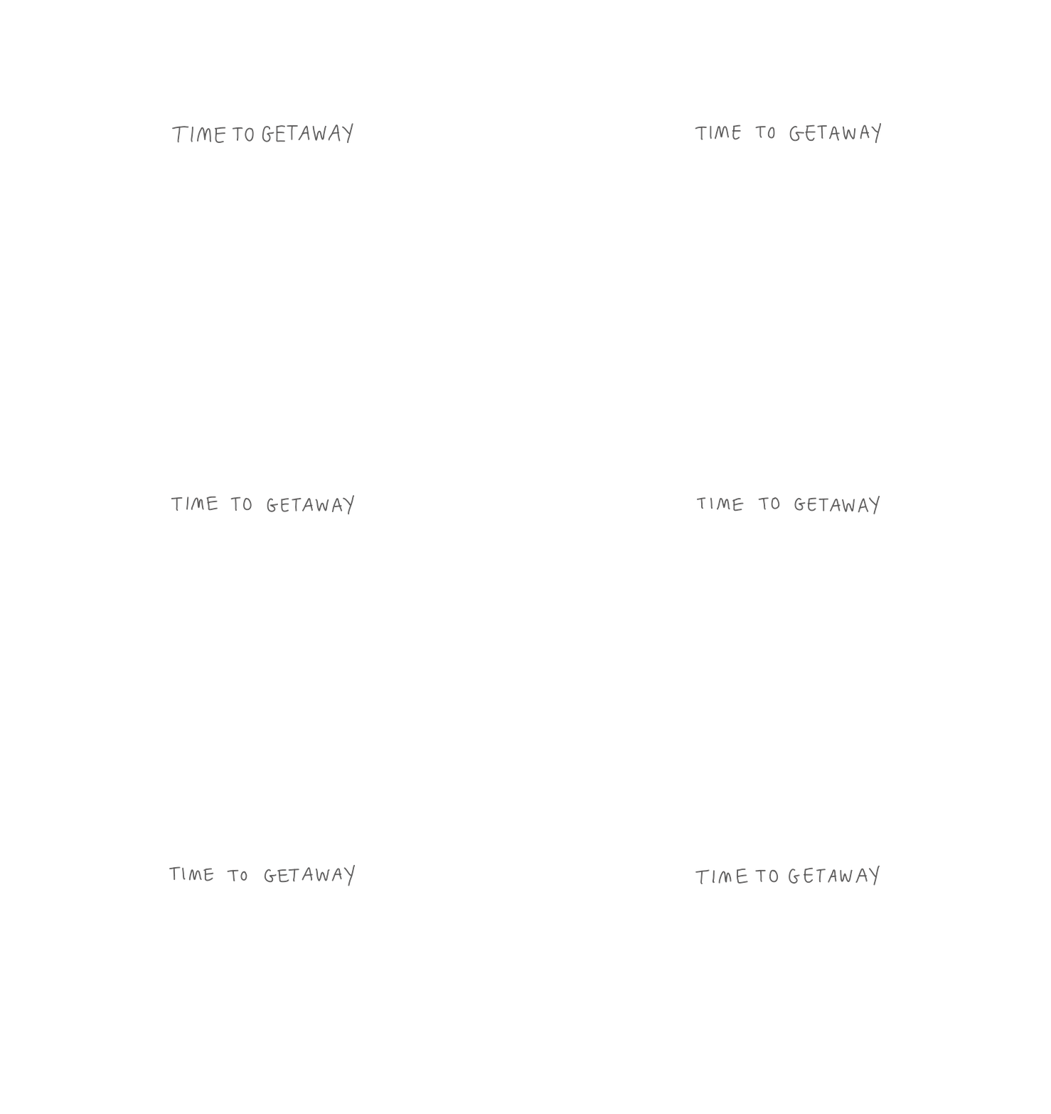
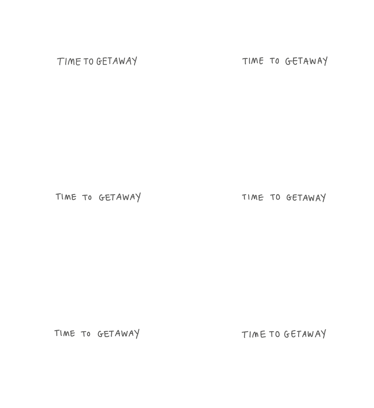
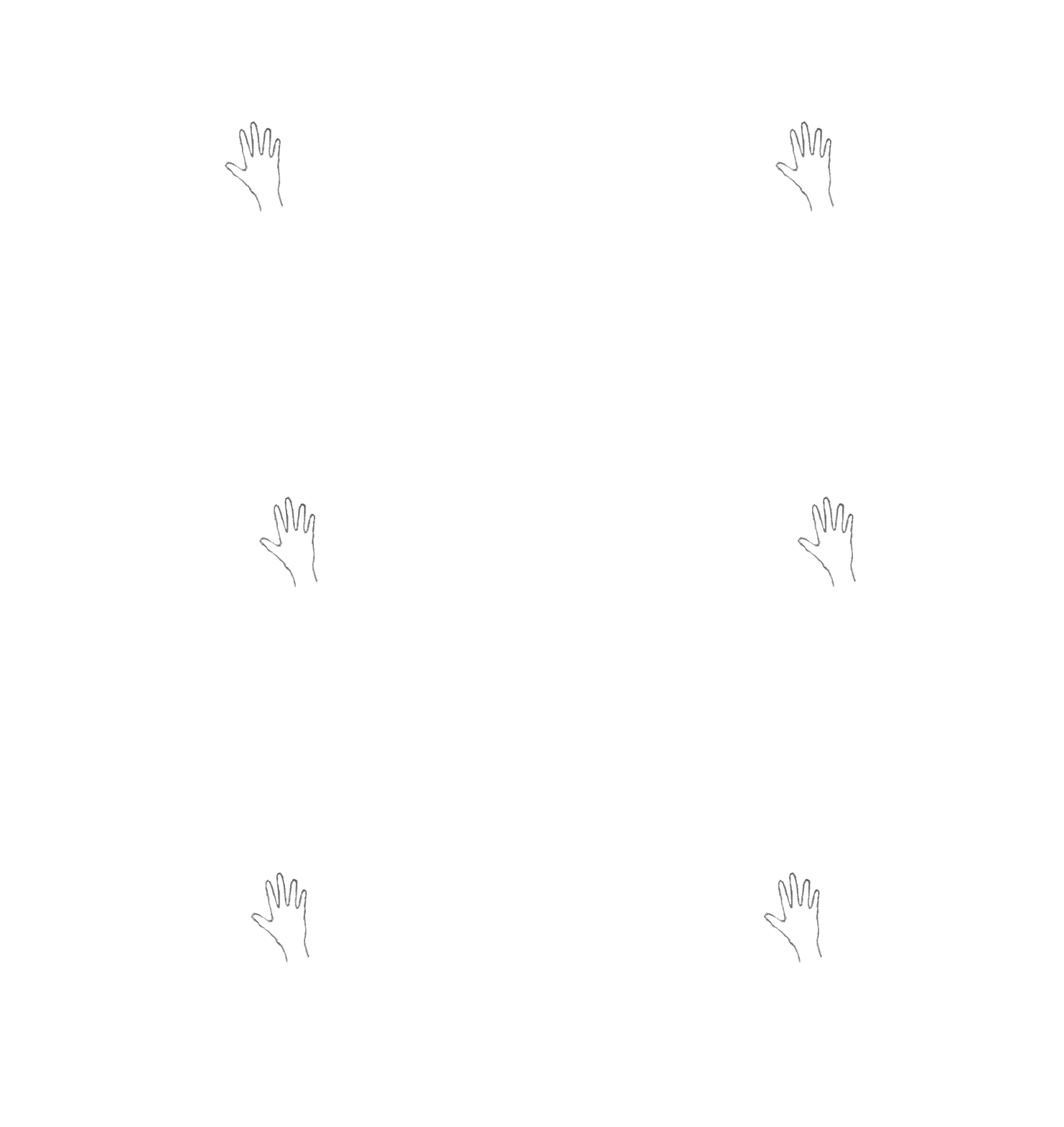
The final design should contain the title "Time to Getaway" in a handwritten animated text. This already brings the space to life without being too overpowering. Underneath this should be a basic left to right hand GIF, to demonstrate how players use their wrist to interact on screen. To avoid misunderstanding and confusion, I have also included the following text underneath the animation:
"Use your hand to guide the bird... Interact with musical snowflakes".
This keeps it simple yet intuitive, and briefly covers the main part of the experience without causing confusion or misleading. As Getaway is mainly an experience based game, we want to provide players with 'mindful tasks' as James referenced last week! This means, the experience should be purely based off natural movement and interaction, and shouldn't be conducted too much. The space should encourage players to move around freely, with the opportunity to do so.


THE FINAL DESIGN
THE BACKGROUND & TEXT
SOFTWARE USED:
Adobe Illustrator
Adobe Photoshop
PROCESS
I began by sketching the simple icons out on my sketchbook paper, using the same materials and surface as we did for our other assets. I then scanned these in using my printer and opened them on Photoshop. On Photoshop, I adjusted the image settings by increasing the brightness and reducing the contrast, which gave me a much harsher line, much more suitable for the environment as this matched with the other assets. I then used the 'Quick Selection' Tool to cut out the hand, in preparation for the GIF.
Next, I prepared the background for the screen! The style of the screen should match the rest of the environment, so I took a picture of the sketchbook paper I am currently using, and edited the image properties until it was much clearer and brighter. I also layered my environment sketch beneath the text, to see how this might look.
Alongside this, I hand wrote the text on Adobe Illustrator, which I was able to export as a PNG and layer on top of the background. I did experiment with the typeface used for our branding material, but felt this didn't work so well.
OPTION 1


OPTION 2


THE ANIMATION
PROCESS
After cutting out the 'hand' illustration in Photoshop, I began to create the animation. I used the 'Timeline' to create a 'Video Animation' which I find easiest. I duplicated the drawing across different layers with very minimal difference in position between them. I then exported the animation into a GIF format.
I then animated the 'Time to Getaway' text, which would introduce people into the experience. I wrote this out six times, with small differences between each font, and followed the same process. This time I didn't change positions, but created different layers, each lasting a second, to create a seamless GIF!
I also animated music notes to go beside the hand, however, I feel this may be too much on screen at once.


SCREEN MOCKUPS
PROCESS
Before implementing the screens into the environment, I wanted to create mockups beforehand, to make it clear how exactly the screen should appear in-game. After seeing both screens mapped out, I much preferred the look of the second concept, with our background faded in the back. This provides players with a hint as to what is yet to come, and eases them into the experience.


REFLECTION
I am really happy with the outcome of this, considering the amount of time I had to create it. For now, this screen fits its purpose, and that's all we can really ask for. The most important thing is for the screen to fulfil its use, which just by looking at it, is more useful than just being handed over the experience! The text is clear, easy to read and intuitive. Next, it'll be necessary to get this projected and put in the space!
NEXT STEPS
The next steps for this will be to implement it into the environment! Using our requirements for the screen, Kiera will be able to successfully import this into the experience, providing users with a basic indication of how to interact beforehand. For now, I'll be sending the separate assets/PNG's over via Slack, as well as documenting within the 'Final Assets' Folder in our sharepoint.
Access to this can be found here:
We are hoping to begin next week with a heavy focus on refining our final game version, and we are scheduled to have this complete by around Thursday 19th May. Next week, I plan to document the changes made and final touches made to Getaway!